Composition & Typography
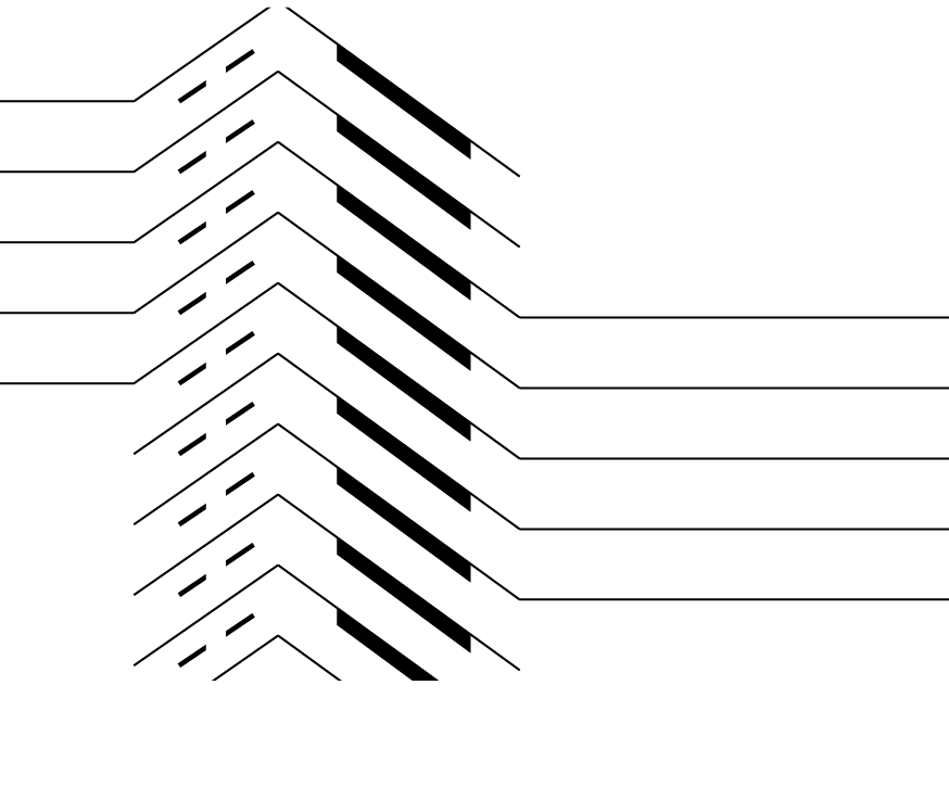
Task 1: Explore the line by creating a black and white A6 size postcard inspired by the architecture of Coventry as part of the Creative Hothaus Coventry project (this is a part of the Creative Hothaus Coventry project).
Response: To fulfil the task, I utilized the rule of thirds and a dynamic progression in line rhythm to create an
eye-catching composition. The postcard is designed in black and white only, as specified in the task, and takes inspiration from the architecture of Coventry.
Task 2:
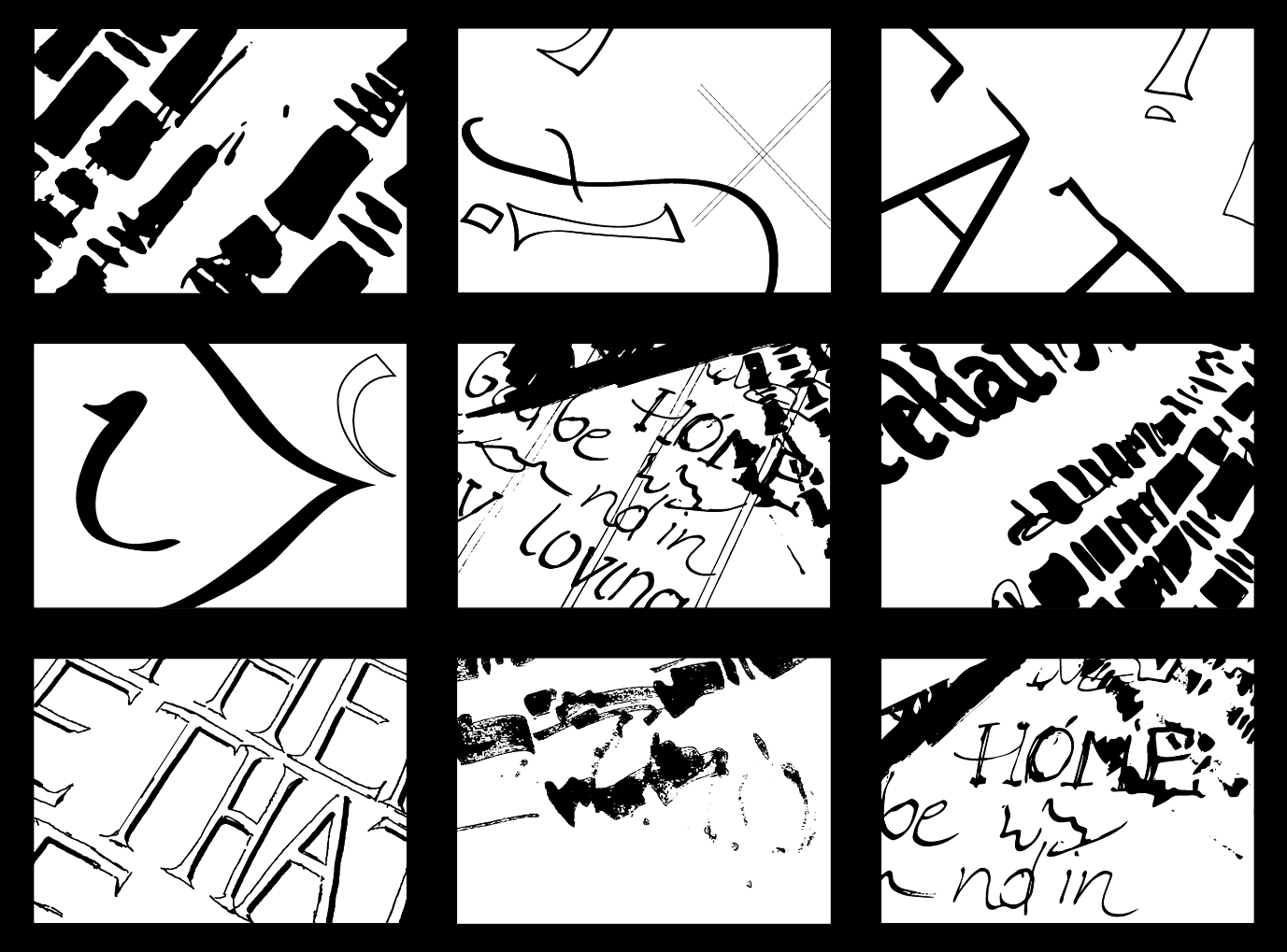
<part 1> Explore the relationship between architecture and typography in Coventry's city centre by creating
a couple of drawings.
<part 2> Using Adobe Illustrator, produce two black and white compositions based on two photos of details from your drawings. One composition should be created using the pen tool, and the other using the brush or pencil tool. The illustrations should be limited to an A6 size document, and no additional elements should be added, only slight cropping is allowed. The goal is to recreate the composition as accurately as possible and to highlight the shape, line, and pattern in your work.
Response: I approached the task by creating a series of drawings that explored the relationship between architecture and typography in Coventry's city centre. The drawings were done in black and white on an A6 size document and were focused on the elements of shape, line, and pattern. To bring attention to these elements,
I varied the thickness of the lines and used contrast and negative space effectively. Then, using Adobe Illustrator, I created two compositions, one using the pen tool and one using the brush or pencil tool, that carefully reproduced the original drawings as closely as possible while maintaining their dynamic quality.
I varied the thickness of the lines and used contrast and negative space effectively. Then, using Adobe Illustrator, I created two compositions, one using the pen tool and one using the brush or pencil tool, that carefully reproduced the original drawings as closely as possible while maintaining their dynamic quality.
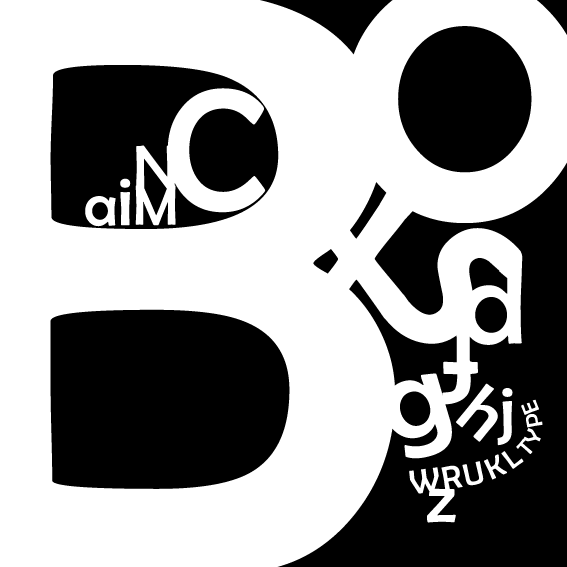
Task 3: On the square format create a visually engaging composition by placing all letters of the Polish alphabet. Restrictions: each letter should be used only once, keep it black and white, and use only one typeface.
Response: I decided to use variable sizes and angles of the letters as well as create some ligatures to create this composition. The rhythm used here is guiding the eye through the image.
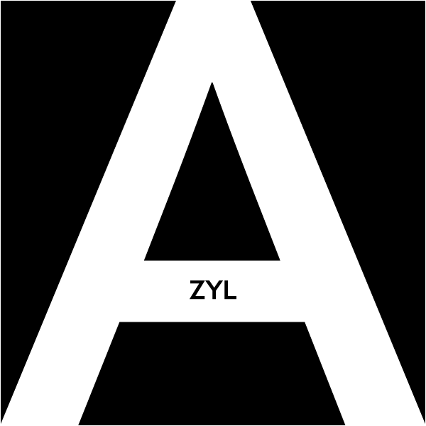
Task 4: Use the typography to visually represent the chosen word meaning in a square format.
Response: The Polish word 'azyl' (eng. 'asylum' or 'refuge') to me is synonymous with a safe place where someone can hide from the surrounding world and the danger. That's why I decided to use the "A" letter as a shelter for the following letters of that word. To put the main focus on the message and its meaning,
I did not add any colour to this image. The strong contrast and negative space build tension within
the composition.
I did not add any colour to this image. The strong contrast and negative space build tension within
the composition.