The brief: To design a corporate visual identity of a Polish bank. Analyze what already exists on the market and provide a clear, fresh design solution that would differentiate it from others and emphasize its professional service. To create a brand that is trustworthy and reliable to its customers.
Explanation: 'Kolo' (eng. circle) in the Polish language might be considered a double-meaning word. The primary is for a geometric figure but the second means also something that is not at a far distance. 'Kolo Bank' in that case is a bank that stays in close relation to its customers. In this project, I decided to use wordplay to make a positive emotional association.
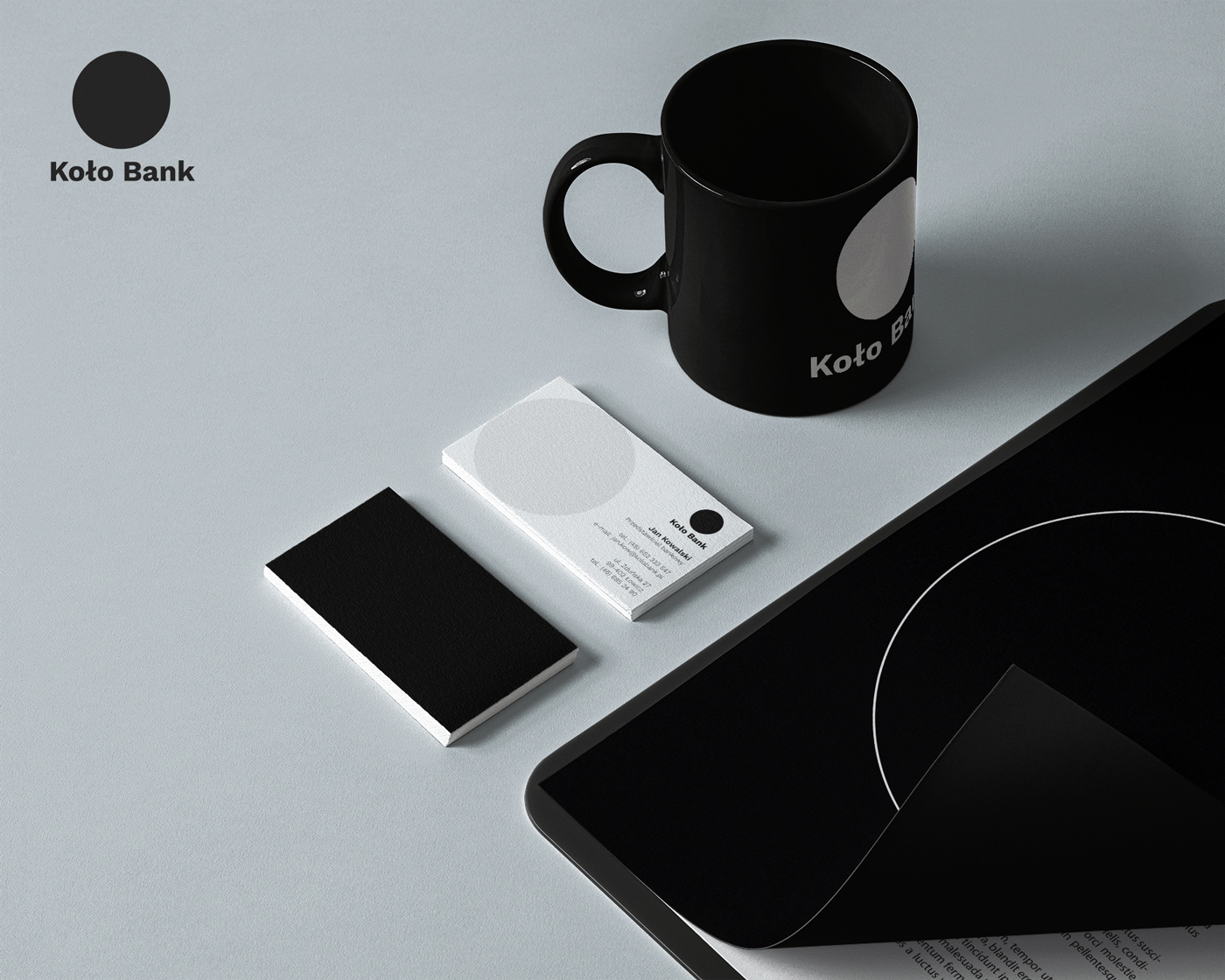
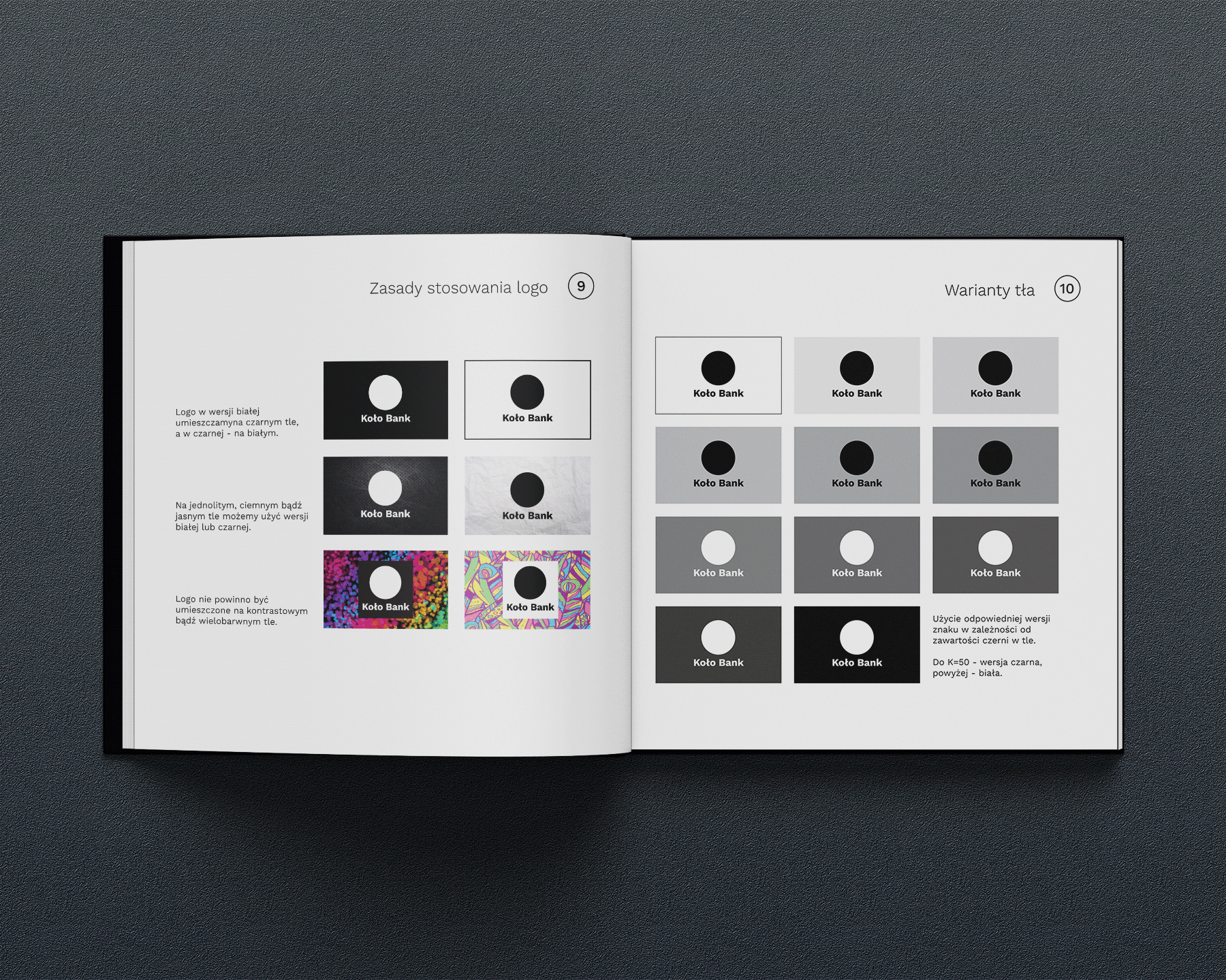
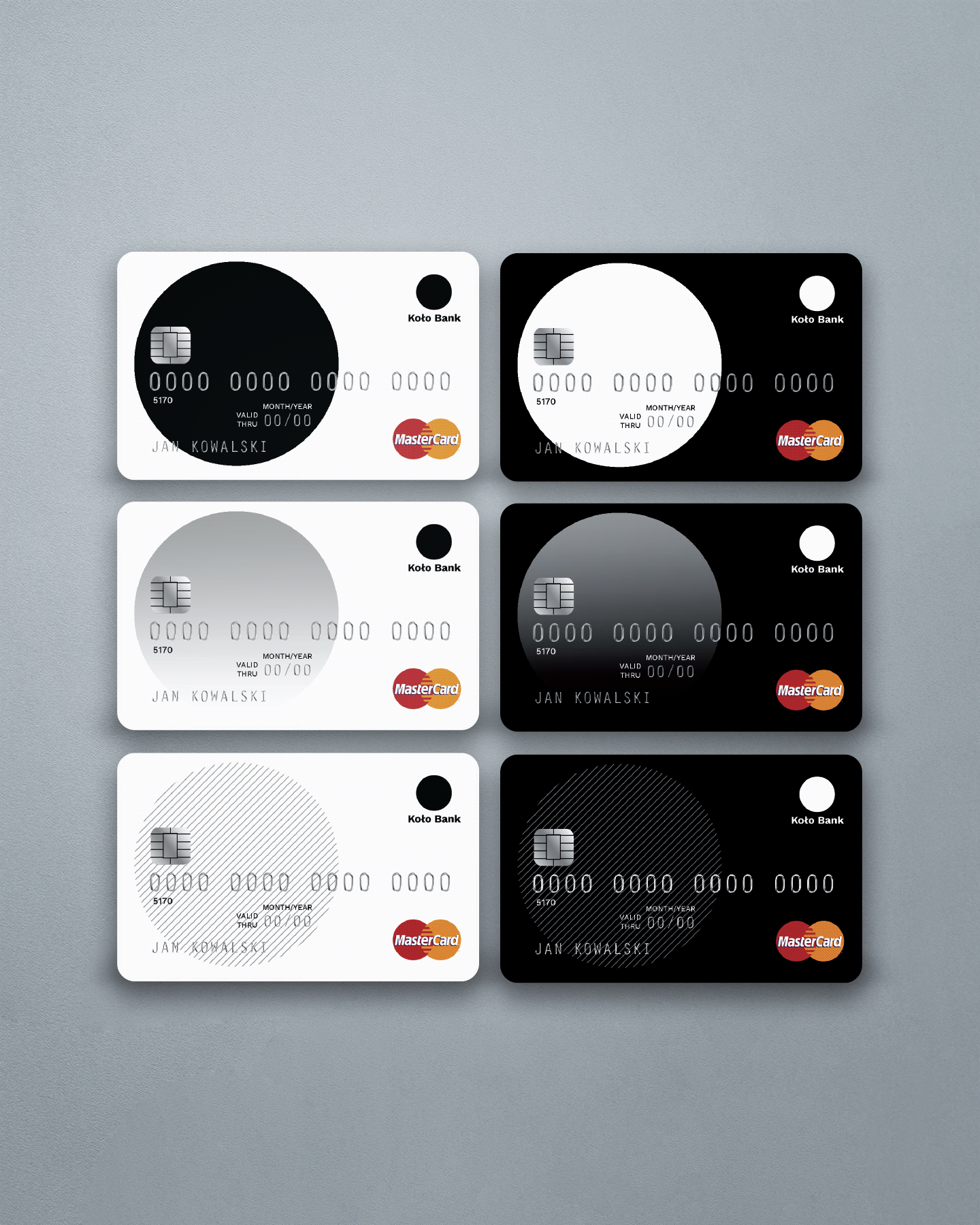
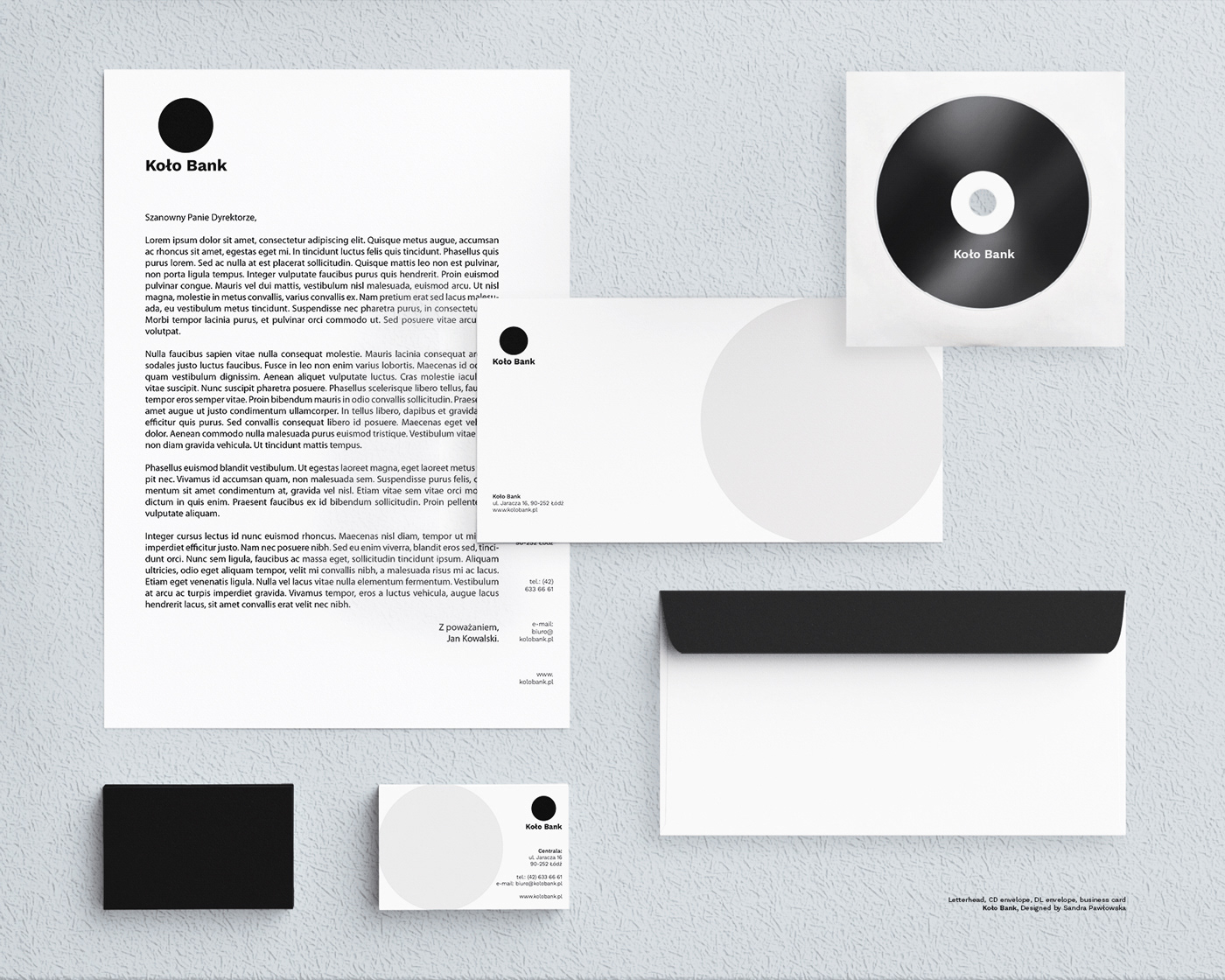
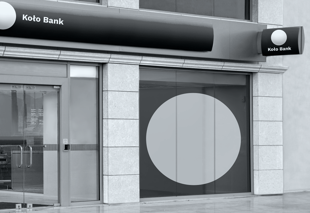
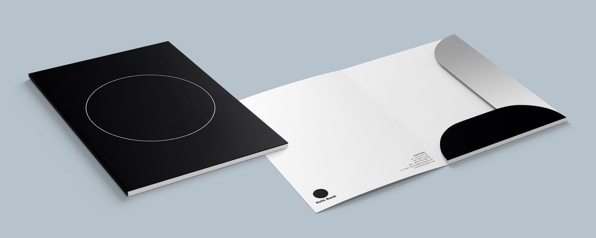
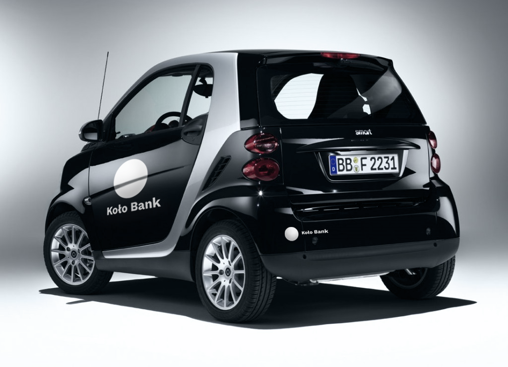
Response: After conducting market research on established Polish banks, it was found that most of them use green or blue in their visual identities. These calm, stable, and balanced colours are frequently used by the financial sector. To differentiate from others, this project uses a black and white colour scheme, which has not been used by any other bank in Poland. While black can be associated with evil, darkness, or grief in some cultures, it can also be elegant and sophisticated when used thoughtfully. The design is inspired by Constructivism and strongly relates to the brand name, "Kolo Bank".
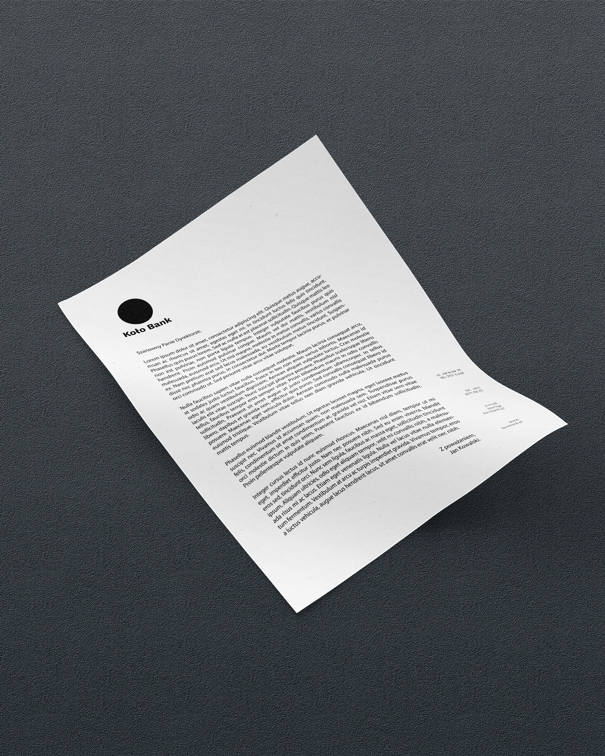
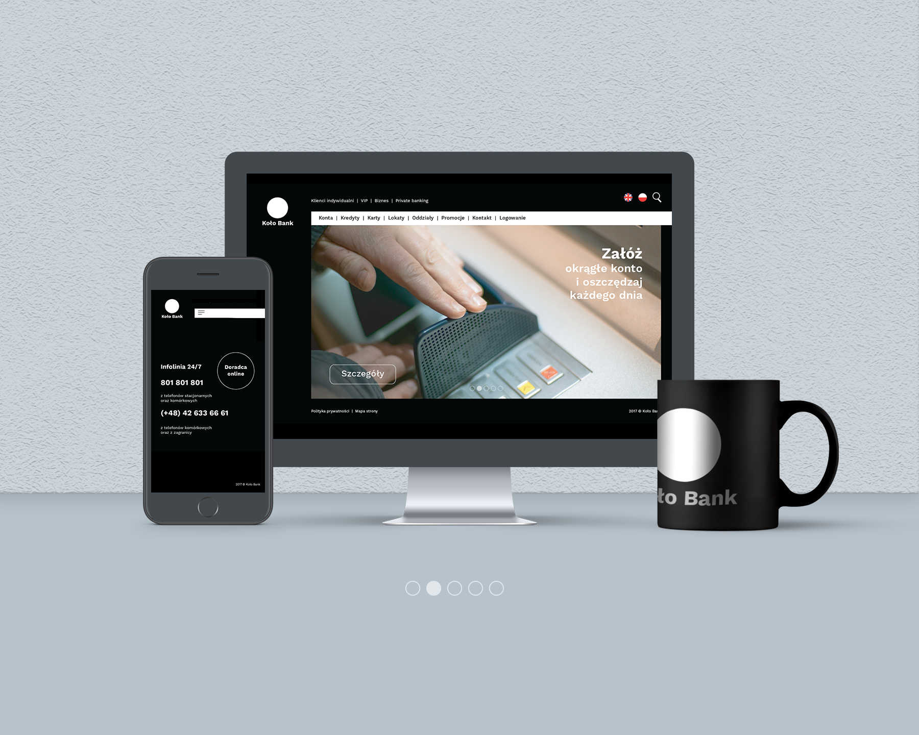
This is a university project created for the degree show. It includes logo design, brand guidelines, stationery, web template, business cards, credit cards, company car, and merch.