
PANDA
The brief: To create rebranding of any chosen company existing in the market (preferred not the most known). Focus on visual identity system: design a new logo, business cards, letterhead, various sizes of envelopes, folder, and a poster.
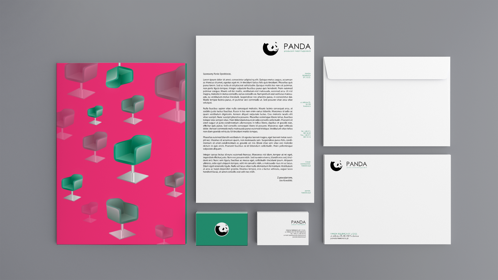
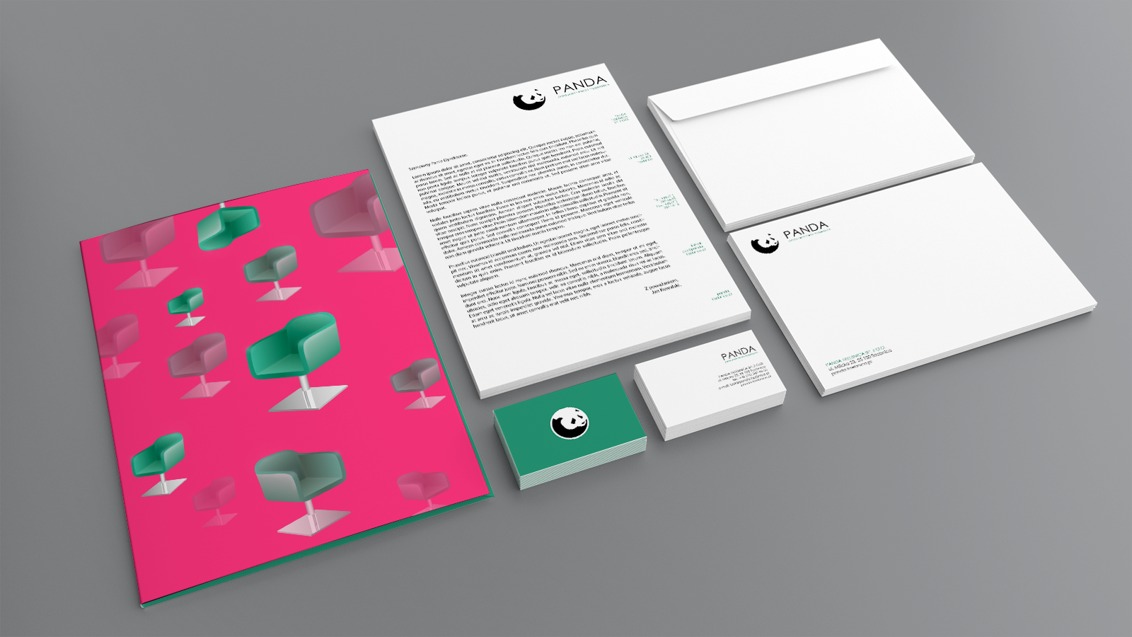
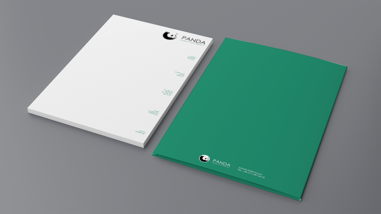
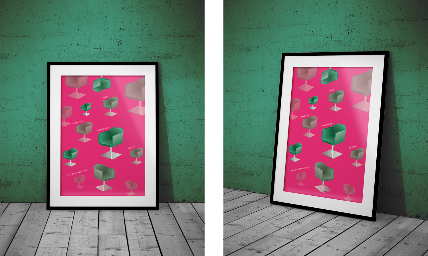
Solution: I have chosen Panda Trzebnica Sp. z o.o. - a producer of hair salon, cosmetic and wellness & spa furniture. My goal was to create a modern-looking brand. To achieve this, I decided to not use photography, but instead drew a vector illustration and created a pattern by repeating the same object for the poster and folder. I varied the size and opacity of these elements to make the composition more engaging. The main focus was on the contrast between the green and pink colors used. I also chose a sans-serif typeface to match the contemporary look of the project, keeping it minimal, clean, and simple.


Logo in progress:

Panda's actual rebranding:
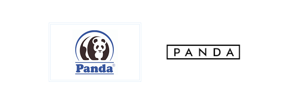
Comment: After a few years since I did this university project, I discovered that in this period of time, Panda actually did their rebranding. In the terms of logotype, they decided to remove the icon and focus on the wordmark. What's most interesting for me, they have chosen a similar typeface but with more spacing between letters and a box around it. A new logo is cleaner and has a more modern look - these are the objectives that I tried to achieve. That makes me believe that I've been moving in a good direction while designing this identity.